Making a barplot
Because R has several wonderful libraries for visualizing data, we will import the csv file in R and generate a bar plot there. This script is relatively short; we just need to add ggplot2 for the plot itself, reshape2 for adjusting the data to a long format and viridis for using colorblind-friendly palettes. Make sure to adapt the input and output parameters as well, to where your query results are stored.
Next, the script adds some necessary properties to the data, like making the EMPO_2 terms a factor. Finally, we use the ggplot2 geom_bar function to make a bar plot.
library(ggplot2)
library(reshape2)
library(viridis)

input <- "C:/Users/username/Input"
output <- "C:/Users/username/Output"

data <- read.csv(file.path(input, "empo_motifs.csv"), sep=',')
data$X <- factor(data$X, levels=data$X)
barplot <- melt(data, id="X")
barplot$variable <- as.character(barplot$variable)
barplot$variable[barplot$variable == 'Non.saline'] <- 'Non-saline'
barplot$variable <- factor(barplot$variable, levels=c("Animal",
                                                      "Plant",
                                                      "Non-saline",
                                                      "Saline"))

motif_plot <- ggplot(barplot, aes(fill=variable, y=value, x=X)) + geom_bar(position="dodge", stat="identity") +
              theme_minimal() + scale_fill_viridis(discrete=T) + facet_wrap(~variable, nrow=4, scales="free") +
              labs(x='', y='', fill='') + theme(legend.position="none")
ggsave(file.path(output, "Figure2a_motif_empo.pdf"), plot=motif_plot, width=4.8, height=6, dpi=300)
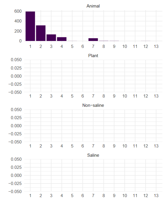
The results should look similar to the image below, although these motif counts are only shown for 5 Animal data sets. For mako’s presentation, we later manually added motif images instead of the numbers, using the motifs shown in the introduction of this case study.